
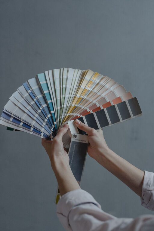
Creating a peaceful, calming atmosphere in your home often starts with one key element: color. The colors you choose for your walls, furniture, and accents can significantly influence how relaxed and comfortable you feel in your space. If you want to design a home environment that promotes tranquility, understanding how to select calm colors is essential.
In this post, we’ll explore practical tips to help you choose soothing colors for your home, explain the benefits of different hues, and offer ideas on how to combine colors effectively to achieve a balanced and restful atmosphere.
Why Choose Calm Colors?
Colors impact our mood and emotions. Bright, intense colors like reds and oranges can energize or even agitate, while softer, muted shades tend to have the opposite effect—they calm the mind and create a sense of peace. Using calm colors in your home contributes to lowered stress levels, better sleep, and a welcoming environment ideal for relaxation and unwinding.
Understanding Calm Color Families
Here are some popular color families known for their calming qualities:
– Blues: Often associated with the sky and water, blue tones evoke feelings of serenity and stability.
– Greens: Symbolizing nature and growth, greens offer a refreshing, soothing presence.
– Neutrals: Soft beiges, greys, and off-whites provide a gentle backdrop that fosters calm.
– Lavenders and soft purples: These gentle hues have a peaceful, almost meditative quality.
– Pale pinks and peaches: Subtle warm tones that can create a cozy, comforting vibe.
Tips for Choosing Calm Colors
1. Consider the Room’s Purpose
Start by thinking about the primary function of the room. Bedrooms and bathrooms benefit from colors that promote restfulness, such as soft blues or muted greens. Living rooms might incorporate warmer neutrals that invite conversation and relaxation, while a home office may need calm but more energizing colors like light blue or gentle grey tones to help focus.
2. Test Samples in Different Lighting
Color can look very different depending on the time of day and the type of lighting in your room. Always test paint samples on your walls and observe them in the morning, afternoon, and evening. Natural light brings out the true nature of a color, while artificial lighting can make it warmer or cooler.
3. Use Color Combinations Wisely
Combining calm colors can add depth without overwhelming the senses. Pair soft blues with warm beiges, or gentle greens with light greys. Avoid contrasting intense colors next to each other; instead, aim for harmony by choosing colors that have similar tones or undertones.
4. Think About Finish and Texture
The finish of the paint or fabric affects how the color is perceived. Matte and eggshell finishes diffuse light and appear more muted, enhancing calmness. Glossy finishes reflect light and can feel more energetic or bold, which you may want to avoid in spaces meant for relaxation.
5. Incorporate Natural Elements
Colors inspired by nature often feel inherently calming. Consider incorporating natural wood tones, stone, or plants alongside your chosen color palette to enhance the soothing effect.
6. Don’t Forget Accent Colors
While calm colors are generally muted, adding gentle accent colors can keep the space from feeling dull. Soft pastels or muted metallics like brushed gold or silver can add subtle interest without disturbing the calm atmosphere.
7. Personalize Your Palette
Everyone reacts to color differently. Choose colors that make you feel relaxed and happy. It can be helpful to gather inspiration by looking at photos online, visiting paint stores, or creating mood boards with fabric swatches and color samples.
Popular Calm Color Combinations to Try
– Soft Blue + Off-White: Classic and fresh, perfect for bedrooms and bathrooms.
– Muted Sage Green + Warm Beige: Invokes nature and warmth, great for living rooms.
– Lavender + Light Grey: A gentle and elegant combo ideal for a serene office or guest room.
– Pale Peach + Cream: Creates a cozy, inviting space suited for family rooms or kitchens.
Final Thoughts
Choosing calm colors for your home is about creating a space where you can relax and recharge. By selecting colors that reflect tranquility and pairing them thoughtfully, you can transform your living areas into restful retreats. Take your time to experiment and trust your instincts—you’ll find a palette that feels just right for your home and your lifestyle.
Remember, calm colors don’t have to mean boring or bland. With the right balance and personal touches, your home can be both soothing and stylish. Happy decorating!